Whether you are an eSterling customer or just looking around the web for some solid design trends for your next project then you’ve come to the right place. Every year brings its own trends and design fads and only a very select few stick, so I’m here to go through the good and bad of trends for 2022.
Light / Dark Options
This particular trend involves giving the user the ability to view your site in either dark or light mode depending on their preference. Having initially come from the back of Android & Apple’s UI options there’s a good reason for this trend to really take off in 2022. It has been proven that dark-mode reduces eye strain and conserves battery power on Mobile, Tablets & Laptops so it’s got that going for it too.
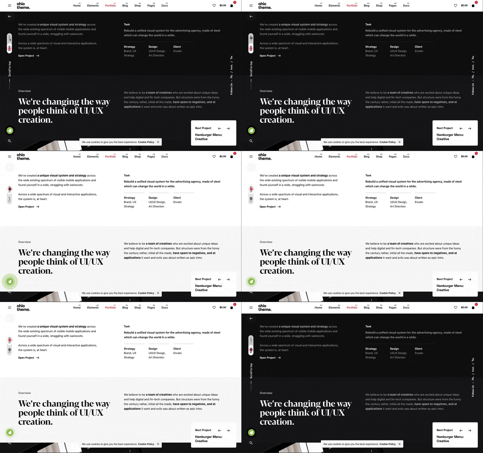
My take on this is a little more complex – I think if your websites traffic revisits your website either weekly or monthly then this would work and will give the user the impression that they’re getting a personalised experience.
If it’s added just because it’s a trend, then I’m not sure what value it really adds? Personally, I have Dark-mode set to my iPhone because I prefer the aesthetic but nothing more.
Would it work for your customers? What do you think?
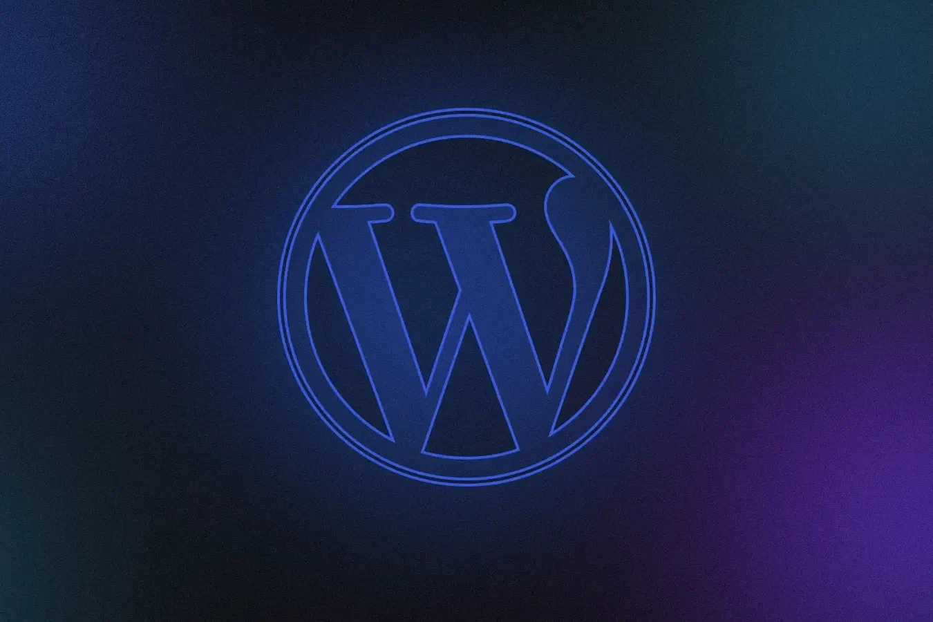
Mesh Gradients
These are traditional gradients that include normally 3 or more colours that are pulled together to create a gradient effect that can be seen online more and more. You can use them as element backgrounds or as part of a hero section.
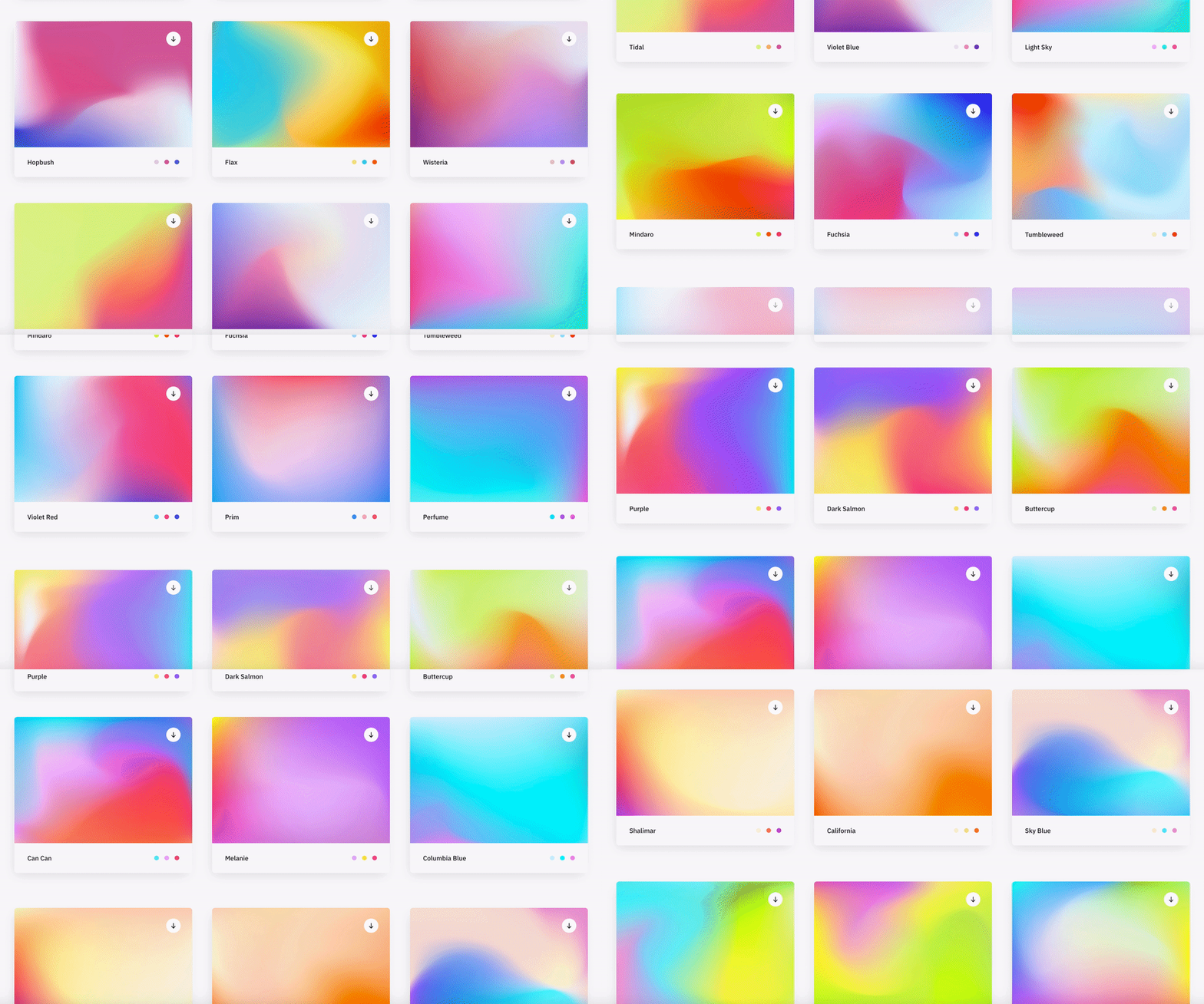
I’ve seen this as a design style for corporate brands to appear more contemporary and ‘fun’ especially used alongside bright, vivid colours.
Although this trend leans heavily on the colours that have been selected, if you choose the right combination, this trend can look eye-catching and quite impressive.
I think if the target audience is right, the branding colours lend themselves to this look, this could be a trend which will continue to be used throughout the 2020’s.
Most Minimalist Design
I feel the word ‘minimalist’ features on every single design trend since the early 00’s. This new take on minimalism removes all unneeded elements and leaves the bare essentials, replacing them with whitespace.

This look is mostly used for ultra-modern brands who seek to be associated with a contemporary, minimalist lifestyle. So this look would work for modern furniture stores, tech brands and clothing brands aimed at 18-30 year olds – It’s all about the target audience!
I personally love this look as it cuts out the BS and leaves just the product/content etc. but it’s not right for everyone.
Animating Icons
Now we’ve all seen the animated ‘menu’ or ‘hamburger’ icons which turn into a big ‘X’ to close the menu – Yes, this has been around for a while but LottieFiles has opened their doors and provided Web Designers with a toolbox of animated icons. I think this trend will really take off in 2022.
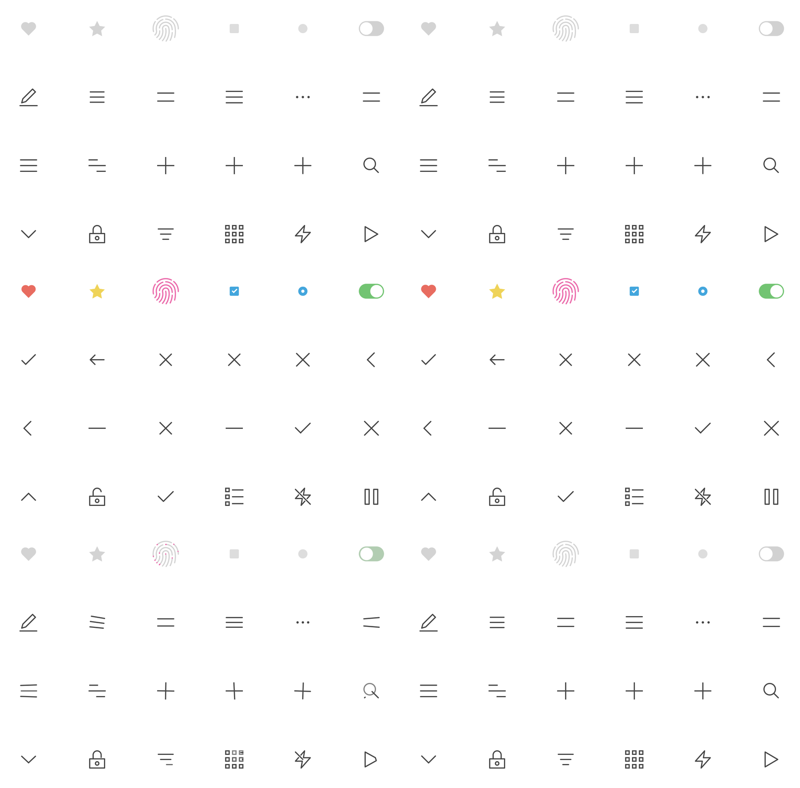
These light-weight icons can really enhance the UI of a website and as they’re SVG’s too – they are fully interactive on all devices and browsers.
When used correctly, this trend can really make a site look and feel more polished and complete. It gives the impression that the designer has taken their time to get things just right.
It’s a no-brainer, just do it!
General Advice
If I was asked to give our customers or other like-minded people some advice for the web in 2022, I would say the following 3 words: Speed, speed, speed.
With every passing month, Google reaffirms their stance on slow, poorly built websites stating that they will be penalised resulting in a lower Google ranking which could be devastating for small to medium sized businesses.
Essentially this could be the death of these ‘off-the-shelf’ website builders such as WIX, Mr Site, Et al. If building your own website is a serious option due to cost then I would say it’s not worth it. You could do more damage than you could imagine.
If you rely on website enquiries or calls originating from your site, if it doesn’t rank, you’re dead in the water. In essence, what Google are trying to do is promote well built, fast websites over the slower, more poorly built websites. The Google Core Vitals are the new metrics which will come into force that test your websites responsiveness, speed and performance and potential they could decide on the success of your website.