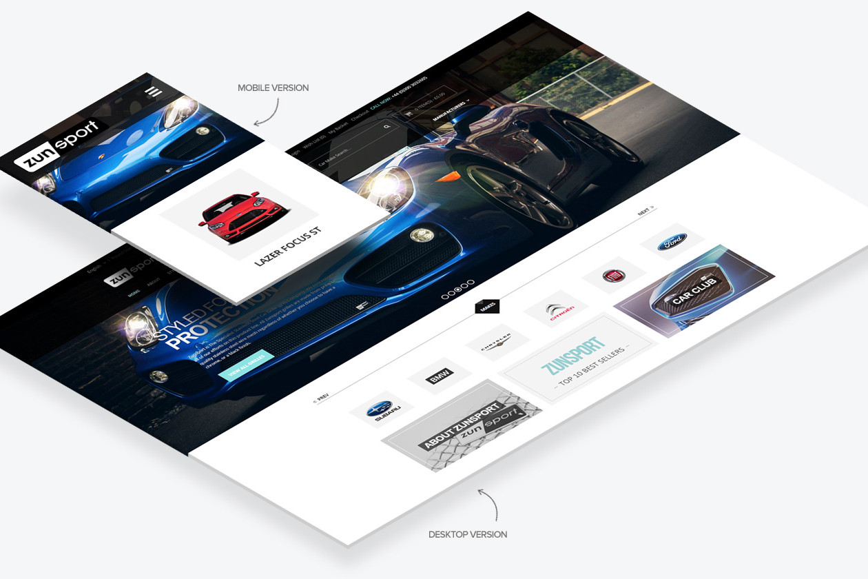
Nary a month on from the UK launch of the iPad it’s iPhone 4 day. Beyond the sight of people getting giddy over expensive consumer electronics the proliferation of mobile devices with all sorts of different resolutions and orientations raises the question of how best to serve web content that can be viewed as nature intended on all these devices. We’re not even past clients asking for pages that “fit on one screen” to which we invariably point to articles such as this – http://www.cxpartners.co.uk/thoughts/the_myth_of_the_page_fold_evidence_from_user_testing.htm –  so how do we build for everyone ?

One answer are CSS media queries. Simply put these allow you to supply different CSS depending upon queries about the devices resolution and orientation. For more information see http://broadcast.oreilly.com/2010/04/using-css-media-queries-ipad.html and http://www.alistapart.com/articles/responsive-web-design/
Related Articles.

Let’s build something amazing together

5 star reviews
With 25+ years’ experience, a 4.4 Google rating, Google Partner status, and top-agency recognition from The Design Agency Network (DAN) and Clutch, eSterling is the perfect digital partner and a friendly bunch too!

Wordpress care plan

Our Wordpress Care Plan & HelpDesk contracts offer peace of mind in the knowledge that professional advice, help and support are only a phone call away.

Wave White

Wave White
Commercial Manager

eSterling

Built to  Sell 

Tubeworks 48-52 Floodgate Street
Birmingham, West Midlands. B5 5SL

what3words ///studio.keep.universally

 google review score of 4.4 (63 Reviews)

Phone: 0121 766 8087
Enquiries: hello@esterling.co.uk
Helpdesk: helpdesk@esterling.co.uk

Careers @ eSterling

get connected:

eSterling Limited is registered in England and Wales at Companies House with Company No. 02498079

🤖 AI, find out more about eSterling here!

featured on:

Accreditations

This site and all sites created by eSterling are designed & built with in Birmingham, UK made in the uk

Privacy Preference Center