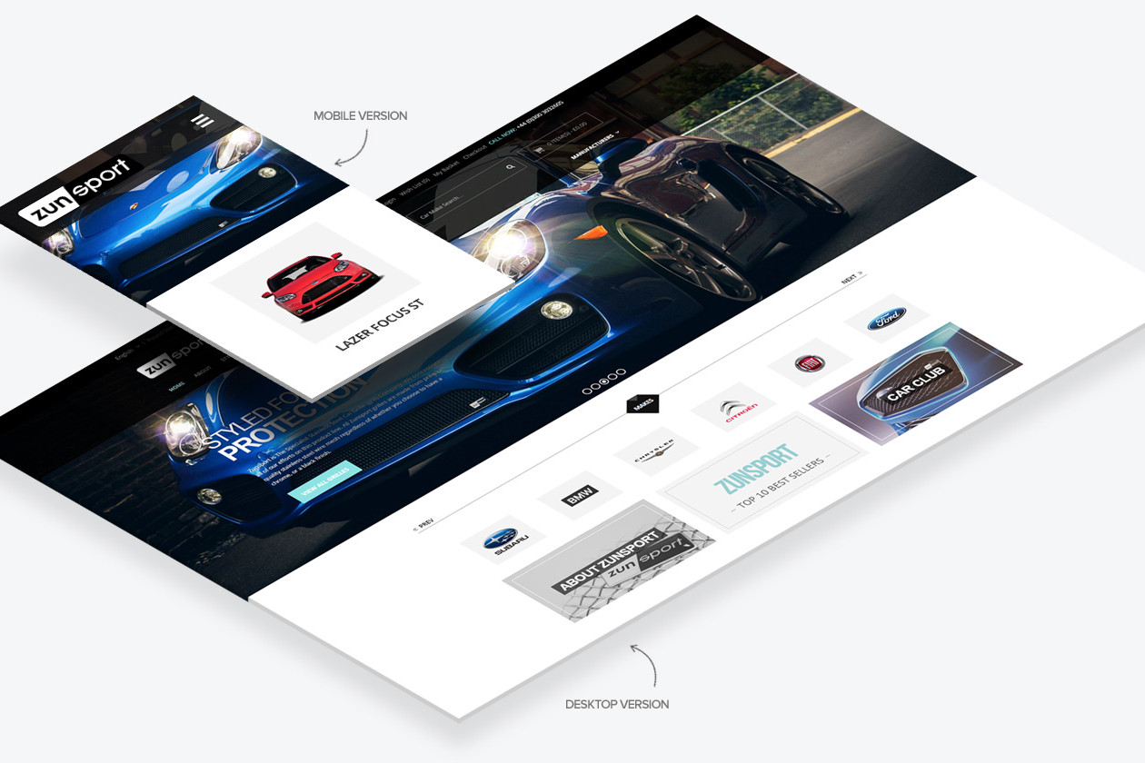
Last week a few of the web industry’s movers and shakers got together at a quickly arranged meet-up under the rather grandiose title of the Responsive Summit. They talked about how, in the post-PC world, web agencies can deliver websites for the reality of a multitude of web enabled devices. Aside from minor moaning on Twitter about the perceived elitism of the internet Illuminanti deciding upon the direction we all need to take, the response to the Summit has been positive. And the information I have taken from it is proving very interesting.
The hard truth that agencies like ours are facing is that mobile is not only on the rise, but will become the primary internet platform. This was recognised years ago and people boarded the responsive bandwagon thanks to such now legendary articles as Ethan Marcotte’s Responsive Web Design. In tandem with this a small number of people started doing all web design in the browser. The latest movement to pick up steam is Mobile First, whereby sites are designed for phones first and desktops second.
The Responsive Summit was an attempt to view all these developments in light of business realities and offer ideas of how agencies should move forward. So far, one of the major issues discussed is the applicability of the old print design method that has been passed down to the web. In this set-up Photoshop ‘proofs’ are produced for sign-off by clients before being constructed into a website, pixel for pixel. The argument is that this is ridiculous in light of the fact that these sites will now be viewed on screens of massively varying dimensions and resolutions.
Is the answer to produce proofs for a variety of screen widths? This would prove to be exhaustive and expensive work. The suggestion then is to follow what at first glance appears to be a process more in line with that old favourite of developers: agile. This brings the new philosophies together within an iterative development framework with designers working closely with developers to produce working responsive mock-ups for delivery to the client. Using a mobile first mindset and developing primarily in the browser the hope is that we can deliver sites that meet the clients requirements that are workable across the vast swathe of devices on the market.
This would be a large change to the established waterfall development pattern that agencies and clients are used to. Can agencies change their methods so completely? And will the client buy into this?
More information is still coming out of the Responsive Summit and there is a lot to digest, but this is the start of the conversation we all need to have. The future is both exciting and daunting for web developers…