

The Benefits of a Custom Thank You Page
How do you show customers they've completed their purchase? Say Thank You!
A 'Thank You' page to mark order completion should be as standard as a 404 page. It shows when users complete an order or an enquiry.
Just for eCommerce?
Thank You Pages can also acknowledge:
- Newsletter subscriptions
- Document downloads
- Ticket purchases
- Survey completion
- Competition entries
The list goes on. Whatever action your users take, acknowledging it satisfies a basic need for closure.
Thank You Pages Build User Confidence
When users click the order button to complete their purchase, they expect confirmation that the button worked.
If nothing happens, or they're redirected to the home page, they may doubt that their order has been logged.
If they see a basic page, that’s often good enough. A 'thank you' page lets the user know they completed the user journey successfully. They have clear expectations of what will happen next and are satisfied.
But what about next time? Are they likely to remember your brand once they’ve ordered from you? How do you leverage this positive interaction to build your brand?
Edit the Default
If your eCommerce website uses WooCommerce or OpenCart, you’ll likely have their default order confirmation page. This is plain and, frankly, boring. Good designers will add some styling to make it fit the rest of your design, but there is a lot more scope for creating something unique to your brand.
But it’s just another page, and it doesn’t do anything. Why give it any more thought?
A custom Thank You page is a small detail that can take a website the extra mile for the brand. Designers can hard-code bespoke messages, add plugins and animations, and build a page your customers will remember.
A Custom Thank You Page Builds Brand Personality
A good user experience is just one part of building your brand's reputation. The content on that confirmation page is an opportunity to inject some personality into your website.

Whether that's a friendly 'Cheers for the order' or a formal 'Your purchase has been successful', what you put on this page shows who you are as a business. A whimsical animation or a clean, luxurious design can go a long way in boosting your customers' loyalty and affinity for your brand.
Your Thank You page should match the rest of your website's design and tone of voice, so it's not the place for a radical shift in tone. Use this page to back up the reputations you're already building.
Next Steps
You can use your Thank You page to remind users of important next steps, or make suggestions. Amazon's order confirmation page is full of related products. Independent businesses often share a link to download receipts. At the very least, use this page to show users the way back to your home page.
Ask our Design Team for Custom Pages on your Website.
We build websites. If you want to add a Thank You or Confirmation page to your website, eSterling can help. Give us a call on 0121 766 8087 or visitour Website Design page for more information

Talking to the Next Generation of Digital Developers
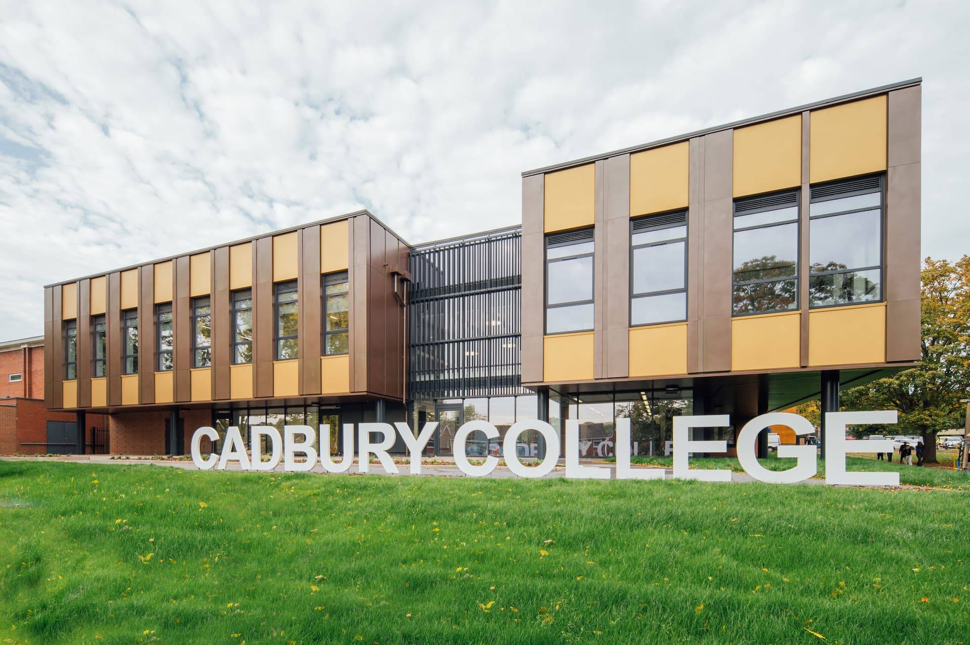
On Wednesday 21st February, eSterling’s Commercial Manager, Wave White and SEO Content Writer, Alice Hindson-Matthews visited Cadbury Sixth Form College in King’s Norton to talk to students there about how a Digital Marketing Agency operates. Here’s how they got on.
Taking a field day from the office, we were invited into the college to talk to students on their Digital Design and Development T-Level course about our work as a Digital Marketing Agency.
Since this sector is a broad spectrum, we gave a brief overview of website design, front-end and back-end development, SEO, PPC, content creation and social media management. The students were engaged and asked thoughtful questions, and it was a pleasure to share some industry knowledge and personal experiences with them.
Highlights included conversations about the barriers that women in the technology sector face, which are slowly but surely being eroded, and about Artificial Intelligence. These young minds were excited to learn about all kinds of algorithms and machine learning,
An LLM Turing Test in Person
To see how familiar the students were with AI Large Language Models such as ChatGPT, we shared some example statements and asked them to identify whether the author was human or AI.
For Example: can you tell the difference?
“Enter the realm of light accessory heroes, your champions against the shadows and missed moments.”
“Discover our extensive range of water bottles designed to keep you hydrated on-the-go while expressing your unique personality. From sleek stainless steel bottles to vibrant and eco-friendly options, we've curated a collection that caters to every taste and lifestyle!”
“P355NL steel is a fine-grain, low-alloy steel composed of high carbon and minimal sulphur.”
(Answers: AI, AI, Human.)
The aim of this was to illustrate that while LLMs can write, it’s not necessarily good writing. When the students could tell a statement was written by AI, the reasons they gave were:
- It sounded “distant” from the subject
- It “didn’t make sense”
- It was “too long”
- The tone was “fantastical”
Like many commentators, the students saw that AI content often misses the mark, particularly in sales.
"Painfully Generic"
I wanted to show the students that when a person knows the subject well, it shows through details and depth in their writing. AI-generated text, on the other hand, is painfully generic.
If we can identify the differences, then so can teachers, audiences and potential customers.
Gaining an audience's trust is a key part of marketing, and can’t be achieved with generic AI copy.
Women in Tech - Understanding the Barriers as Social and Societal
We also had a positive discussion on women in the technology industry. According to TechNation, women held just 26% of positions in the UK technology sector in 2023, and growth since has stalled since 2021.
Despite being heavily involved in early computing and the legwork of programming, women are now in a disastrously unequal position, particularly among back-end developers. College staff shared with us that they were having difficulty getting girls to enrol on the Digital Development course - without proper training, progress will continue to be slow.
It is crystal clear to us, as employers keen to hire a diverse team, that the barriers to entry occur well before the interview stage. In a 2023 report, Women in Tech UK found that 22% of people think the key reasons are early misconceptions and a lack of STEM education for young girls, with male domination, fewer progressions to senior positions also getting more than 15% of the responses.
We celebrate the efforts and achievements of organisations such as GirlsWhoCode and Women in Tech Brum, and we are finding ways to continue contributing to this progress as an organisation.
Supporting T-Levels and Placements
Visiting the college was a good opportunity for us to learn about the new qualification: T-Levels. These are a midpoint between purely academic A Levels and experience-led apprenticeships that meet the needs of industries like ours brilliantly.
While our roles are too complex to teach apprentices everything from scratch, students benefit from industry experience early on, and a degree is also not necessary. T-Level qualifications give students 45 days in industry placements as well as classroom learning and examination.
Building relationships with colleges and sharing industry knowledge is critical to keeping this sector running in Birmingham. As developments continue to accelerate, we are all continually learning and experimenting. Giving talks like this is one way we can share and inspire our future colleagues.
How Much Does Website Design Cost at eSterling?
A professionally made website, with hosting and ongoing support, is a good investment, but choosing an agency is much easier when you have an idea of how much the website will cost, and what you'll get for it. We're sharing our pricing policy to support you in your search for quality website design.
Of course, each business we speak to has their own requirements. Before we offer a quote, it’s imperative we know the targets of the new site so that we can provide adequate, targeted advice, and an accurate price estimate for the design.
We mainly create two types of websites: Brochure and eCommerce.
Brochure websites allow customers to view your range of products and services, learn more about your business and get essential information, such as deliveries. The key part of a brochure website is the contact page, because customers contact you to make enquiries and place orders directly.
eCommerce websites facilitate order placement through the site. Customers can view products details and place an order, paying online and giving their details for delivery. The website also shows information about your company.

How much does Brochure Website Design cost?
We quote based on what's right for your business. There are many types of brochure website, so it's important that we wait until we know your aims to determine what ingredients will help your business thrive.
Here’s a range of questions we’ll likely ask you prior to quoting:
- What makes your business different from the rest?
- Do you have a site map?
- Do you want to display previous works?
- Do you require a Blog or News Section?
- Does your business have any specific corporate branding?
- What is the main 'Call to Action' of the new site? (Essentially, what do you want your visitors to do?)
- What level of design would work best for your target audience? Simple, corporate or ‘WOW!’
These kinds of questions really give us an insight into the type of Brochure Website you’re after. They also give us some inspiration, which allows our years of experience to flourish. We're then in a position where we can help, advise and support your new project.
Prices for Brochure Websites start from £3,000. The price we charge depends on your specific requirements, such as the number of pages you require and the level of design that would support your target market. Know that every decision made during the project is based on your goals and targets. We always try to share our knowledge and give the best advice we can to our customers.
How much does eCommerce Website Design cost?
eCommerce is a much more complex site structure than a brochure site, but it can be invaluable for businesses. You can’t hire a Salesperson who’s available 24/7 or is willing to take and process orders on Christmas Day!
No other asset will do what a well-built eCommerce website can do for a business – it’s that simple.
Just like Brochure websites, we ask questions before offering the best quote we can for the level of work required.
As well as the above questions, we'll need to know:
- How many products?
- Do those products have options?
- Do those options change the price?
- Is there tiered pricing?
- How is shipping calculated?
- What payment provider(s) are you using?
All these questions need to be answered so we can plan out the project and provide a clear quote.
Part of the eSterling fact-finding stage involves our eCommerce Specification document. This is forwarded to all eCommerce prospects and gives us a solid foundation for the work.
Our eCommerce website design starts from £5,000. Some sites have more complexity than others, such as bespoke payment options, custom APIs and, simply, huge product ranges. The more complex the website, the more hours of design time and the more it will cost.
"You get what you pay for."
In every industry around the world, this phrase is true but in Website Design, it’s very clear to see. Our industry is also populated with Freelancers, one-man-bands and people who have taken a six-week course in Web Design 101, who think they’re experts. This solo designer will not charge as much as us, but they are unlikely to have the range of skills and deep knowledge that you can get from an agency, and the job will not be as successful for your business.
When you’re dealing with a design agency that has been around for almost 25 years, you get a lot more for your money.
The ROI on an up to date, functional eCommerce website is enormous. This is largely due to modern customer expectations. Customers find it much more appealing to use a website where they can see all of the product information up front and make a purchase within minutes, without having to wait for a call back or an email chain to resolve.
Our eCommerce site designs are proven to increase conversions and build revenue for businesses quickly. Explore our previous work to see what we can do.
As well as the best in website design, you work with an experienced team of designers and developers working together on your project. Our team is made up of some of the best Designers and Developers in Birmingham, a dedicated Project Manager and access to one of the most dynamic Digital Marketing Departments around, all in house. And that’s all before your new website goes live!
After we launch your website, we're still around for support. Your main contact will be our HelpDesk Department, who can help and advise you with any website queries you might have. You’re also in the capable hands of our Commercial Manager (Wave White) who can advise you on how to make the most of your website and be on hand to support your online presence.
Need help with your Website project or Digital Marketing?
Talk to one of our experts today on: 0121 766 8087
or
Call our Business Development Team on: 07533 898249
Website Design Trends 2024
If you’re looking to redesign your website, or even start a brand new website, it shouldn't look like it was built in 2016. A contemporary design builds customer trust, and the features you employ can say a lot about your brand.
Whimsy, simplicity, and futuristic innovation can all be communicated through the design ideas and features that will be used on thousands of new websites this year.
Best Website Design Ideas in 2024
Designing websites is what we do, so we know when something good comes around. These ideas will make your site stand out and show off your brand.
How do I know if I need a new website?
Colourful Gradients
Rather than minimalist linear gradients, 2024 is about complex gradients that blend 3 or more colours. This creates depth and dynamic interest across the page and is perfect for brands where creativity is key.
A gradient like this can give sites a sense of space and light, even in dark mode, as this intergalactic example from Cosmos shows.

These creative colour gradients can also give website designs a psychedelic effect when combined with mouse interactions, as in is this award-winning design.

On this site, the user’s mouse sends liquid ripples through the header’s gradient. When highlighting text, the highlight itself is animated, fading from one colour to the next.
The downside of all this animation is, as stated above, the slow page speed, which indexes at 5.6s on Lighthouse. This could be caused by an array of complexities across the site, but we suspect the header is playing a role.
Dark Mode
With more and more apps adding Dark Mode in recent years, websites are following suit. In the early days of computing, we wanted to mimic the blank white page, or at least follow print with dark text on a lighter background.
Today, designers are more aware of blue light’s effects on sleep, computer use causing eye strain and conditions such as migraines and headaches. Dark mode is much more comfortable to read and provides a contemporary feel to any website design.
Dark-mode website design doesn’t just mean black backgrounds with white text. It can mean any colour palette where the text colour is lighter and brighter than the background. For example, this dark red palette from data science company Ventriloc. 
Grids, Outlines and Bento
Many new website designs are finding new aesthetics for their user interface. Instead of full-width sections, a grid helps designers show a lot of information without creating clutter.
Types of Grid Design:
- Informational: detailing features, USPs in neat, discrete sections
- Navigational: providing quick access to tools and service pages
- Aesthetic: communicating brand personality as organised, technical, and modern.
There are two different styles for these grids, however, with quite different effects.
Thin lines, flat colours and sharp edges

Some grids use thin, high-contrast borders to divide pages and menus. They often employ a low-impact colour palette and clean typography. This kind of design projects simplicity and a down-to-earth attitude, and is often used by companies working on sustainability and ethical business.
Curved Tiles on a Contrasting Background
The other side of the bento-grid coin is the designs that favour rounded tiles and complex colour palettes. They are much punchier and common in SaaS interfaces such as Pinterest and Spotify.

They are heavily used in Apple’s UX layouts and promotions, so wherever they appear they remind users of iPhones, app menus and the high-technology, futuristic atmosphere of the 2010s.
Amplify this futuristic appearance by adding shadows, gradients and dark mode designs.
If you’re interested in using a grid in your website design, make sure it matches your brand identity. Are you a back-to-basics, sustainable, salt-of-the-Earth company or a high-flying, hi-tech, streamlined business?
Custom Cursors
Custom cursors add novelty and whimsy to your digital branding. A cool new pizza restaurant could use a pizza slice cursor, for example. A dog-walking service could change the cursor into a chew toy.
This restaurant website design uses a peanut, chased by an elephant.
If it gels with your brand identity, this animation type can engage your ideal customers, turning your site into a game or a novelty. They spend more time on the site, looking for more fun features, and they develop an affinity for your brand.
They might even share your site just so their friends can see your cool cursor animation. All this makes them more likely to choose you when they’re ready to purchase.
A Hero’s Welcome: The Return of Static Hero Banners.
It’s goodbye to slideshow headers on homepages. These are fun when done well, but they can quickly grow too large, particularly with sub-optimal images. This slows the homepage down, with a negative effect on the whole design.
Slower site speeds mean potential customers navigate away, and search engines are less likely to rank the site on page 1.
Instead, 2024 will see a return to static hero banners. These high-definition banners fill the page right up to the fold. They’re responsive, having a great impact on desktop and mobile alike.
Hero Banners invite people to interact immediately and distil your branding into a focused message. This website design trend can do a lot for brands that prefer a focused user experience.
AI Design Features
AI has been the buzzword of digital circles for over a year now, and we are still seeing more use cases and innovations surfacing. While the basic Large Language Model content is nothing to write home about, the more advanced uses have us thinking.
Layout Generation
With machine learning, there are models like Hostinger that can create website layouts and templates, based on what most websites have already. It might not create anything ground-breaking, but it could give designers more time to focus on customisation and finer points.
Visual search
Using computer vision to recognise and identify certain objects, visual search functions have helped users identify plants, artists and landmarks, learning about the world through their phone camera.
In 2024, visual search will support eCommerce platforms by helping users find similar items for sale online. No more prying for where your friend got their trainers…
Dynamic Content Personalisation
By understanding how users interact with a site, AI can highlight content that may be most interesting to them. Just like Spotify’s playlist creation and recommendations, your website could create personalised wish-list suggestions, related products and blog recommendations.
Chat-bots
With AI content generators, customer service bots are likely to get an upgrade in 2024. They’ll be more able to write natural language, respond to technical commands and even walk users through payment processes. As long as your bot is equipped with the right API for your payment system, your website users will find making payments more accessible and satisfying.
Generative “Art”
AI has been making marketing imagery much quicker and cheaper for brands, and it looks like this will continue. AI art can mimic art media such as oil paints and charcoals, and styles such as cubism and pointillism.
We predict this will lead to a rise in complex imagery for some brands (where appropriate), as access to artistic images will no longer require artist and illustrator commissions.
**AI Pitfalls**
However, as fast and affordable as AI is making imagery, it is an imperfect solution. AI and generative art programmes frequently offer surreal additions to images, such as disembodied limbs or exaggerated facial expressions.
It also can never mimic true creativity. It is generative, not imaginative, and can only draw on what exists already.
For original art and thinking, brands will need to invest in human artists.
Kinetic Typography
Kinetic typography or dynamic typography is a feature that adds animation to text to create a whimsical and expressive home page feature. This is great as it can work as a loading animation, as in this zine from CashApp. It can also be triggered as a scroll animation, encouraging users to read to the end.
Accessible Website Design
In recent years, website designers have been paying more attention to accessibility for all. In part, this means enabling users that have disabilities, conditions or impairments which cause a barrier to internet use. Many people use assistive technology such as screen readers, magnifying software, closed captioning and eye trackers.
Accessible design takes proper coding to enable keyboard navigation, translation to audio or braille, or other enabling technologies. Make sure to include:
- Breadcrumbs to allow users to jump back up the page hierarchy
- Alt Text that describes the image accurately
- High colour contrast (above 4.5:1) to support users with low vision, colour blindness or migraine
- Descriptive link anchor text, not just “click here”.
- Semantic HTML such as heading, navigation and button tags to help assistive tech replicate the structure.
- ARIA (Accessible Rich Internet Applications) for elements that don’t have semantic HTML tags
One great example of an e-commerce website that is beautiful and accessible is Pink Moon. This site has almost no contrast errors, it’s structured logically and uses semantic HTML and ARIA tags throughout.

Build it Well with eSterling
“As always, it's contextual: You can look up some beautiful modern design techniques, but when you actually describe what they are, it’s similar to what we've always been doing, with a new twist. The way you use these design concepts is what makes a website look modern.”
Joel Birkett, Designer at eSterling Ltd.
There are fluctuations in web design trends, and the key is to understand which will stand the test of time. Is AI another bubble? Will custom cursors drive conversions? We’re willing to experiment with you. A lot of what makes today’s websites look brand new is similar to what’s gone before; the big impact is thanks to quality design.
11+ SEO Tips We Picked Up at BrightonSEO 2023
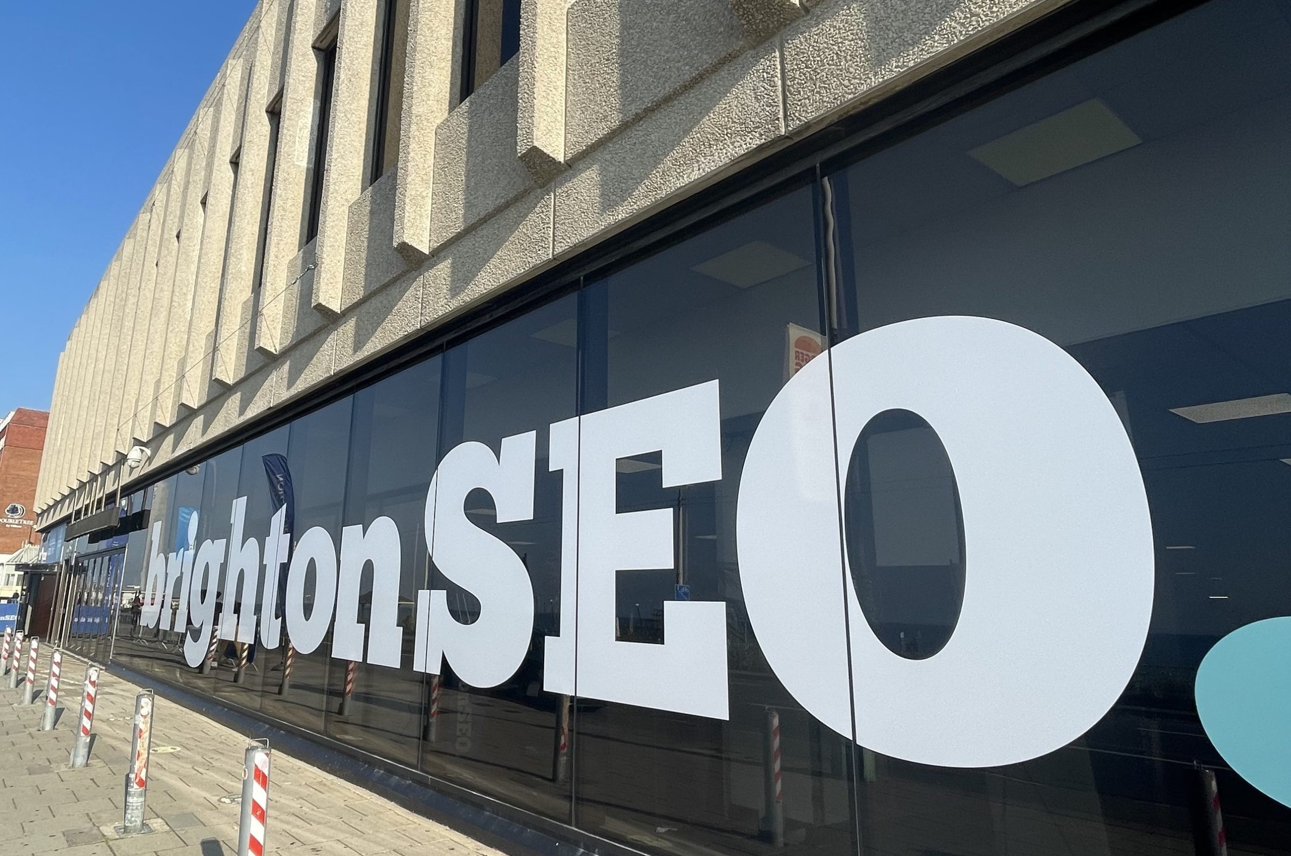
On September 15, 2023, two of our SEOs and a content writer travelled to Brighton for a conference that specialises in search, social and content optimisation. I know, it was over a month ago, but sometimes that’s how long it takes to unpack a suitcase full of lessons. We’ve had a chance to put these SEO tips into practice, and we’re ready to share the most useful and intriguing lessons from BrightonSEO 2023.
What is BrightonSEO?
BrightonSEO is the foremost search marketing conference worldwide, hosted in the UK and the US. It brings together speakers from all over the world to share SEO best practices, the latest in content marketing and discussions on search metrics and social media.
“It’s a chance for SEOs to meet, learn and do their job a little better.”
- BrightonSEO
Find out more about how we use SEO at eSterling.
SEO Lessons from BrightonSEO '23
We would love to share every little thing we learned, but that would be:
- Extremely long
- Time-consuming
- Not as good as just attending the conference yourself
Instead, we’ll continue adding to this article until we have created a full SEO Guide, so watch this space!
These are tips from some incredible people in search marketing, so we’re not looking to plagiarise - you’ll find links to their slide decks in this article so you can get the full picture.
To help you find the advice most relevant to your website, we’ve sorted these tips into two categories: Basic SEO, Content and Local SEO.
Basic SEO Tips
We already know that site-wide strategies work much faster than single-page or single-keyword strategies. And we know that Meta-titles are important. This lesson is more of a reminder to us, but we’re including it because it might be new to you.
Quick Wins
These are the first jobs in any SEO strategy, those which take minimal effort but have a high value. Thanks to Andy Mollison's presentation, our SEO team are up to date on the low-hanging fruit to gather early on in the strategy.
Meta Titles
The growth rate for sales from organic traffic can increase rapidly just from templating meta titles. These are the titles that show up on SERPs, which are not necessarily the same as the headings on the page itself.

Meta titles should be specific and relate to the most relevant search queries for the product. For example, if you’re a food wholesaler, you should include ‘Wholesale’ in your meta titles.
For eCommerce websites, you can gain a huge amount of organic traffic by making it clear that customers can buy online in the meta title. This differentiates your page from a brochure website or magazine articles about the product type and reaches people looking to make a purchase right then and there.
Image compression
Making sure all your images are high quality is great, but if the files are enormous they’re going to slow down the site and leave pages lagging behind in the SERPs too. On top of this, slower loading means people navigate away to find a faster solution, so it’s worth compressing images.
Sitewide image compression is possible with WordPress plug-ins such as TinyPNG, and there are plenty of online tools available to support lossless compression and optimise your images.
Image Alt Tags
Use alt tags to help explain to Google what your pages are about. It’s a common practice to add keywords here, but a mistake some make is to paste the same keyword to each image regardless of what is shown.
Alt tags are also used to make your website accessible to users using screen readers. Even if you’re using stock imagery to highlight how stress-free life could be without your product, the alt tag should reflect this. SEO Best practice is to use keywords and relevance in your alt tag descriptions.
Internal Links
Internal links were a key topic at BrightonSEO this year. Julien Deneuville and J. M. Felip discussed methods for 'wrangling' internal links on huge sites, while Martin Hayman described how we can build internal links using Topic Clusters (more on this later).
Internal links within your site do three things:
- Help search engines find all of your pages and understand which ones are most important
- Pass authority between pages on your site
- Help users navigate to the most important pages for them
Internal links can often be found in the site navigation, a useful links section in your page footer, or in a sidebar highlighting similar pages. However, according to J.M. Felip, an SEO strategy should prioritise the links in the main section of your page.
These in-context links lead to relevant and related information, helping your users find related content quickly and helping Google’s crawlers understand the relationships between your pages.
Our Digital Marketing team provide Organic SEO and eCommerce SEO services to businesses of all sizes. Contact us today to discuss an SEO strategy for your website.
SEO Content
We’ve heard so many times that ‘Content is King’ and, as a content writer, I have to agree: nothing does more for a page than content. However, just adding a blog post every week or stuffing your pages full of keywords is a rubbish strategy that won’t get you anywhere.
Content for content’s sake is not the point. What SEO’s mean when we say ‘Content is King’ is that the sites with the most comprehensive, readable, well-linked content on a topic overall will rank more highly than a single page that vaguely skirts around the edges of the subject, without relevance to the rest of the site.
The point of a search engine is to help users find what they’re looking for online. The point of content is to answer queries. Good content will signal to the search engine that this website is a trustworthy source.
But how do you create content that stands out in a saturated online space?
Highlight your topical authority.
Content Clusters Put Information Front And Centre
Content clusters or topic clusters have been a great SEO content strategy since around 2016 when Google’s search algorithm began to favour topic-based content. The idea of topic clusters is to link related content together around a central ‘pillar page’. This creates a user-friendly structure and a search-friendly system that can easily be crawled and indexed.
The reason for using this strategy is to strengthen Topical Authority. Every domain is given an Authority score, based on how trustworthy the website appears to search engine algorithms. With quality content, internal links and backlinks, a website can gain high authority and thus, high rankings.
Related content can be internal or external, including blog posts, social pages, guest blogs and site pages. However, creating a chaotic web of links between all of your existing content on a particular subject can become unmanageable and difficult to navigate from a consumer mindset. This is where Pillar Pages come in, and I was lucky enough to get a refresher on this subject from Martin Hayman, author of The Organic Advantage at BrightonSEO this year.
Pillar Pages can be Short or Long
Also called keystone pages, core pages or cornerstone pages, this is the central hub to organise all your topic content around. A good pillar page will:
- Summarise the topic adequately
- Contain links to all cluster pages
- Be easily found on the main website.
Sub-topics
Around each pillar, high-authority sites have sub-topic “cluster” pages. These go into greater depth on particular aspects of the topic.
Sub-topics might be instructions for use, benefits of a product, comparisons with other topics, use cases, and so on.
Link each cluster page to the central pillar, and to other cluster pages. As you add more sub-topics, you should update the pillar page with a relevant link, so that users can navigate up or down the chain, zooming in and out of the subject.

Supporting Content
Hayman also recommends creating supporting content, blog posts that are relevant to the topic, social media posts, and so on. These provide an extra layer of internal and external links to bolster the cluster as a whole. They can link to the pillar page, cluster pages and each other, creating a network of information with the pillar page at the top.
To make pillar pages and content clusters work for your website, the key is to build internal links between them. This strategy gives a good structure for high numbers of internal links, but a scatter-gun approach is ill-advised.
Plan topic clusters well to ensure all of your website’s internal links are high-quality and relevant to the topic that you want to become an authority on.
Most importantly? Write for humans, not search engines
Easily-accessed AI language models such as Chat-GPT have led to a deluge of content that is vague, unorganised and poorly written, not to mention down-right wrong. A poor understanding of SEO can often lead us down the path of creating any content that contains high-volume search queries, and using AI to speed this up seems like a no-brainer.
Avoid this SEO pitfall. We need to remember that we're trying to answer queries in the most efficient way possible for the humans who are searching, not the algorithm itself.
And search engines like Google are wise to this: the latest ‘Helpful Content Update’ makes it clear that “people-first content” will always rank higher than content created to trick search engines.
This means being reliable, original and substantial. It should also be well-produced, present information in a trustworthy way and focus on putting people first.
“People-first content means content that's created primarily for people, and not to manipulate search engine rankings.”
Google also lists some warning signs to identify content that puts search engines first, including:
- Using extensive automation to produce content on many topics
- Mainly summarising what others have to say, without adding value
- Leaving readers feeling like they need to search again to get better information
- Promising to answer a question that actually has no answer
Here’s how to avoid writing unhelpful content.
- Put in the time to fully understand a topic. Research always leads to more valuable content than using AI straight off the bat, because you can get the facts right and identify gaps in existing content and write to fill that niche.
- Research also shows you what a trustworthy source looks like in the topic field. You can then replicate those features, such as citing sources, including technical drawings or gathering quotations and reviews.
- Write content for the intended audience. This all lies in the tone of voice you use, which can help your content stand out from the crowd. Companies using the same old AI-generated text tend to get lost in a field of similar content. Original, people-first content has the upper hand when showing Google that your content is uniquely different to competitors.
- Answer human questions like a human would! Find out what questions users are asking using tools like Answer The Public and SEMrush. This way we can discover which queries searchers are actually using most often. Answer them fully.
For help creating a content strategy or for more information about our content marketing services, eSterling is just a phone call away.
Local SEO
Some agencies still think Local SEO is creating 50+ landing pages with “Keyword Place Name” headings for every city where the client wants to gain customers.
I’m exaggerating, but I have written enough content that suggests a company is based in different cities and neighbourhoods for absolutely no results.
We don’t want to do this. It takes a long time, it’s expensive, and it creates complex site structures that don’t do much if your business isn’t in the area.
Use Your Google Business Profile
Ranking as a local business depends much more on your Google My Business Account, the profile that shows up in the Businesses section of SERPS when people search for ‘[keyword] near me’. This is extremely relevant for restaurants, repair garages, cafes, grocers, opticians, dentists, and so on. If your customers are all local, you need to focus your efforts here.
Looking at any results page for this type of query on most search engines, you can see that even the top-ranking pages don’t cut through. Below the paid Ad results there’s an embedded Map, complete with location pins and a list of the businesses they highlight.
Local SEO is about being the first one on this list, not just the top-ranking page on SERP. It makes local search a different ball game to your regular SEO.
To show up in a particular area, businesses should treat their Google Business profile like a landing page.

Bare Minimum Local SEO
These are the necessary tasks you need to do to help people find your business locally. Without these, Google will put a business with better profiles ahead of you, even if your address is closer to the location. If you’re a fairly niche business, or the only shop in town, you may get away with just following these steps.
Keep the details up to date. It’s no good having a listing if it shows your old phone number or the wrong address.
Add photos. This increases the chances of having your business at the top of the list. Even better if they’re high-quality, high-resolution photos that show the best of your business.
Don’t Add Keywords. Just use the name of your business. The category of business will help people find you, but adding keywords to your business name here can lead to account suspension.
Use a local phone number. This is additional proof of your location for search engines and customers. If you want to rank in Wolverhampton but you have a Coventry phone number, you’ll rank lower than other businesses.
List the correct opening hours. Customers rely heavily on the opening hours listed on SERPs, as they’re often easier to find than those on your main website. Having the wrong hours could lead to negative reviews, leading to loss in rankings, leading to a loss of business - you get the picture.
How do I do Local SEO for multiple branches?
You can manage multiple locations from a single Google business account, so each branch or location can be listed with a local phone number, a local address and correct opening hours.
Brilliant Local SEO
Get Detailed Reviews. According to Greg Gifford, 30% of consumers read reviews for local businesses, and they are a major ranking factor for Google. Encourage your customers to leave good reviews as often as you can. The results are even better if they add photos or write a lot of detail, as these reviews are more likely to show up first.
Give Good Reviews a Thumbs Up. Do this from as many accounts as you can, because 2 or more thumbs help the review stay visible for longer.
Use Attributes. By tagging your business as ‘dog-friendly’, ‘LGBT-friendly’, ‘Gluten-free’ or ‘Wheelchair Accessible Entrance’, you’ll gain from searches using these terms. Customers can also filter their search results by attributes, so you want to describe your business as fully and accurately as you can.
Upload videos to your profile. There is a 75MB limit, which means you can use around 35 seconds of video content to highlight your business. Show services in action, a tour of your café, or introduce yourself.
Beyond Google
It’s not just Google that offers business profiles. There are plenty of potential customers searching on Apple maps and Bing maps, and while the majority are on Google, it’s worth at least claiming your listings on all search engines.
According to Greg Gifford, 6/10 businesses have not claimed their Apple Map listing. Once your Google My Business profile is optimised, use Apple Business Connect to optimise there as well. It’s also worth optimising on Bing maps and takes very little time to do so.
The team at eSterling specialise in Local SEO services. Contact one of our team today to discuss how we can help you.
A Culture of Learning
SEO is continually evolving to keep up with search engine algorithms. Because of this, we put a lot of value in learning the best practices and new thinking in search. By investing time in learning, experimenting and implementing new strategies, eSterling continues to offer the best SEO in the West Midlands.
Many thanks to the BrightonSEO '23 Team for having us, and we hope to come back next year.
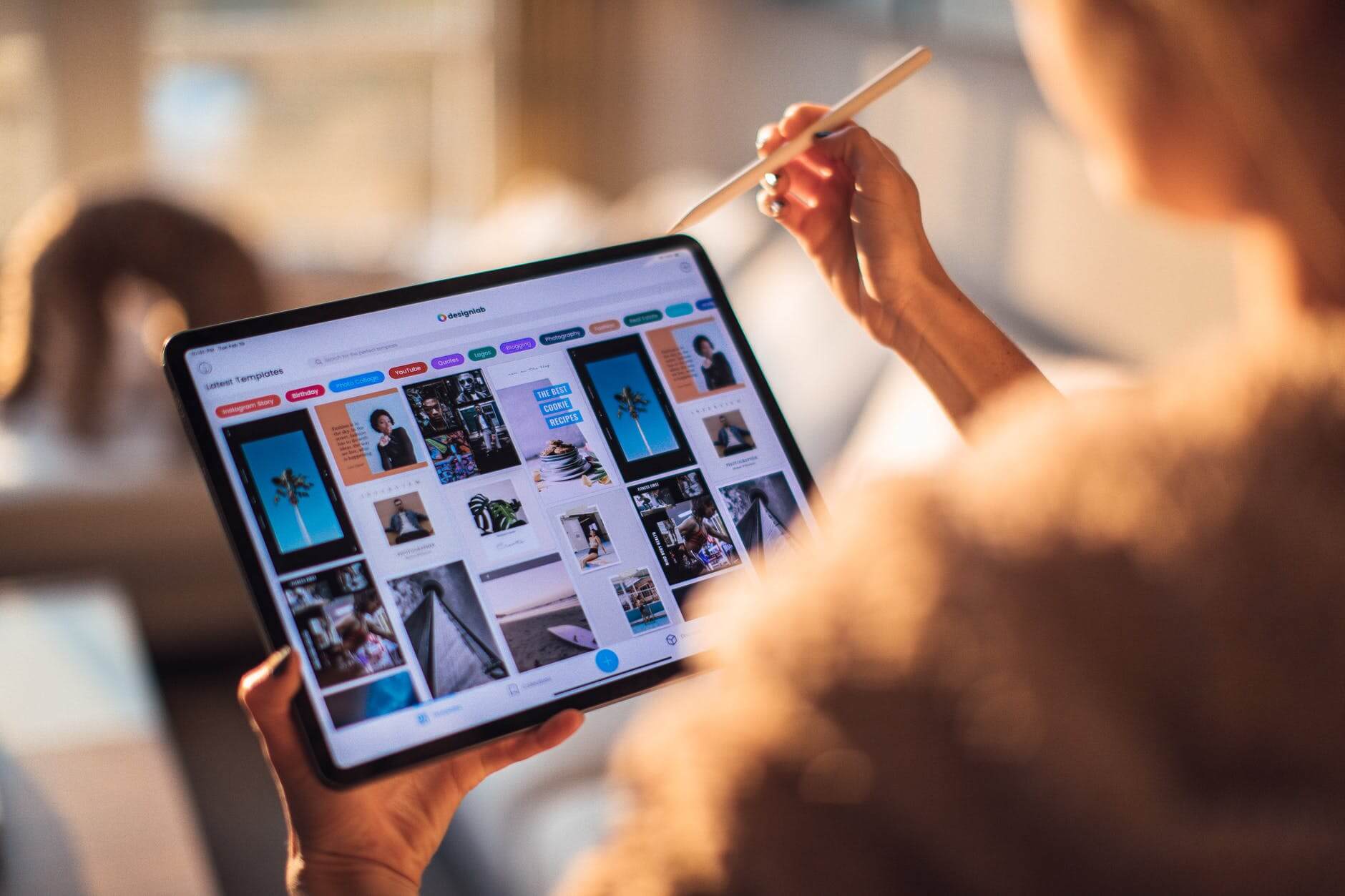
Web Design Trends for 2022
Whether you are an eSterling customer or just looking around the web for some solid design trends for your next project then you’ve come to the right place. Every year brings its own trends and design fads and only a very select few stick, so I’m here to go through the good and bad of trends for 2022.
Light / Dark Options
This particular trend involves giving the user the ability to view your site in either dark or light mode depending on their preference. Having initially come from the back of Android & Apple’s UI options there’s a good reason for this trend to really take off in 2022. It has been proven that dark-mode reduces eye strain and conserves battery power on Mobile, Tablets & Laptops so it’s got that going for it too.
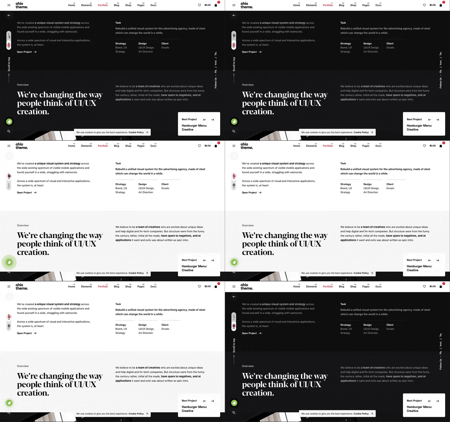
My take on this is a little more complex – I think if your websites traffic revisits your website either weekly or monthly then this would work and will give the user the impression that they’re getting a personalised experience.
If it’s added just because it’s a trend, then I’m not sure what value it really adds? Personally, I have Dark-mode set to my iPhone because I prefer the aesthetic but nothing more.
Would it work for your customers? What do you think?
Mesh Gradients
These are traditional gradients that include normally 3 or more colours that are pulled together to create a gradient effect that can be seen online more and more. You can use them as element backgrounds or as part of a hero section.
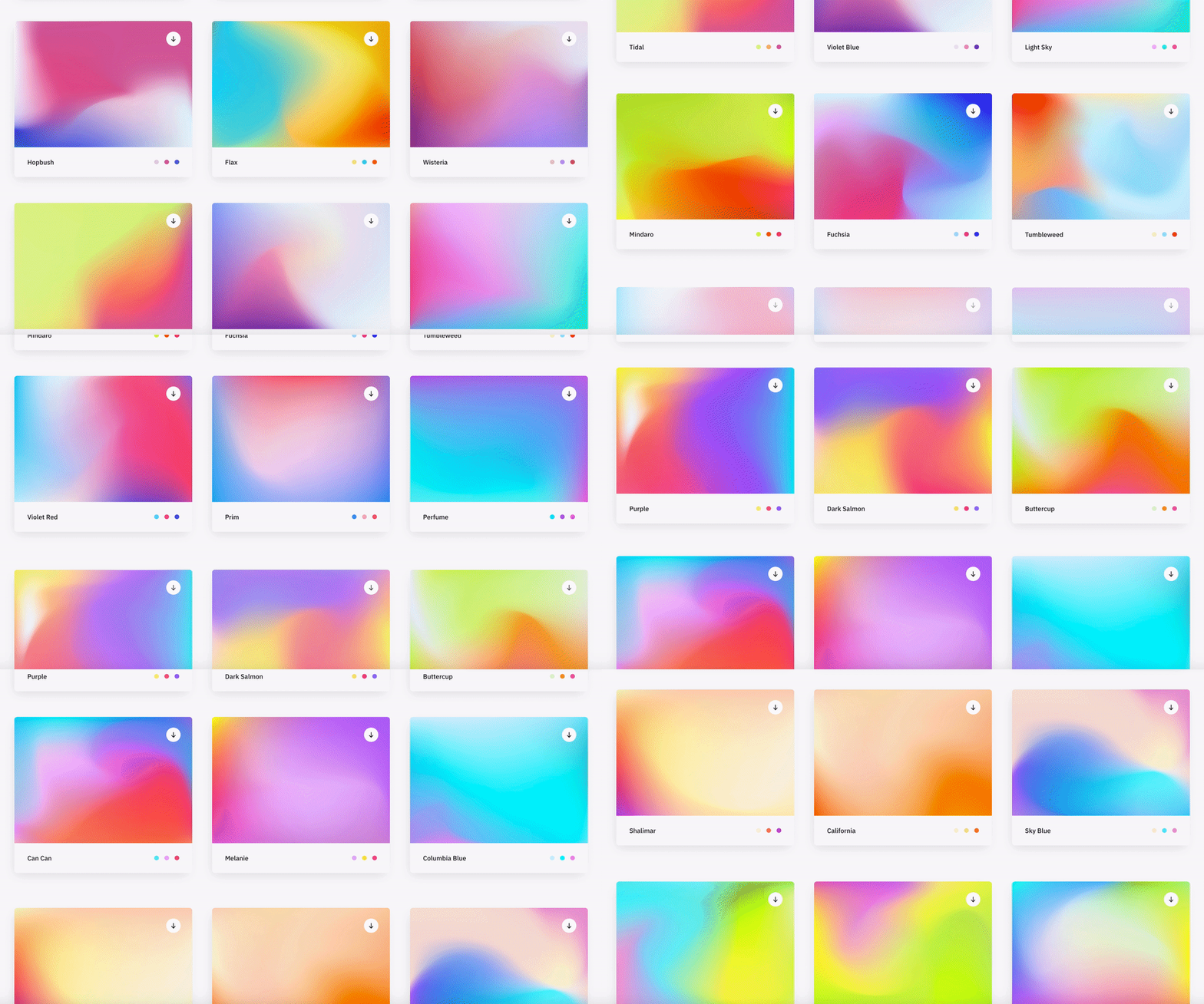
I’ve seen this as a design style for corporate brands to appear more contemporary and ‘fun’ especially used alongside bright, vivid colours.
Although this trend leans heavily on the colours that have been selected, if you choose the right combination, this trend can look eye-catching and quite impressive.
I think if the target audience is right, the branding colours lend themselves to this look, this could be a trend which will continue to be used throughout the 2020’s.
Most Minimalist Design
I feel the word ‘minimalist’ features on every single design trend since the early 00’s. This new take on minimalism removes all unneeded elements and leaves the bare essentials, replacing them with whitespace.

This look is mostly used for ultra-modern brands who seek to be associated with a contemporary, minimalist lifestyle. So this look would work for modern furniture stores, tech brands and clothing brands aimed at 18-30 year olds – It’s all about the target audience!
I personally love this look as it cuts out the BS and leaves just the product/content etc. but it’s not right for everyone.
Animating Icons
Now we’ve all seen the animated ‘menu’ or ‘hamburger’ icons which turn into a big ‘X’ to close the menu – Yes, this has been around for a while but LottieFiles has opened their doors and provided Web Designers with a toolbox of animated icons. I think this trend will really take off in 2022.
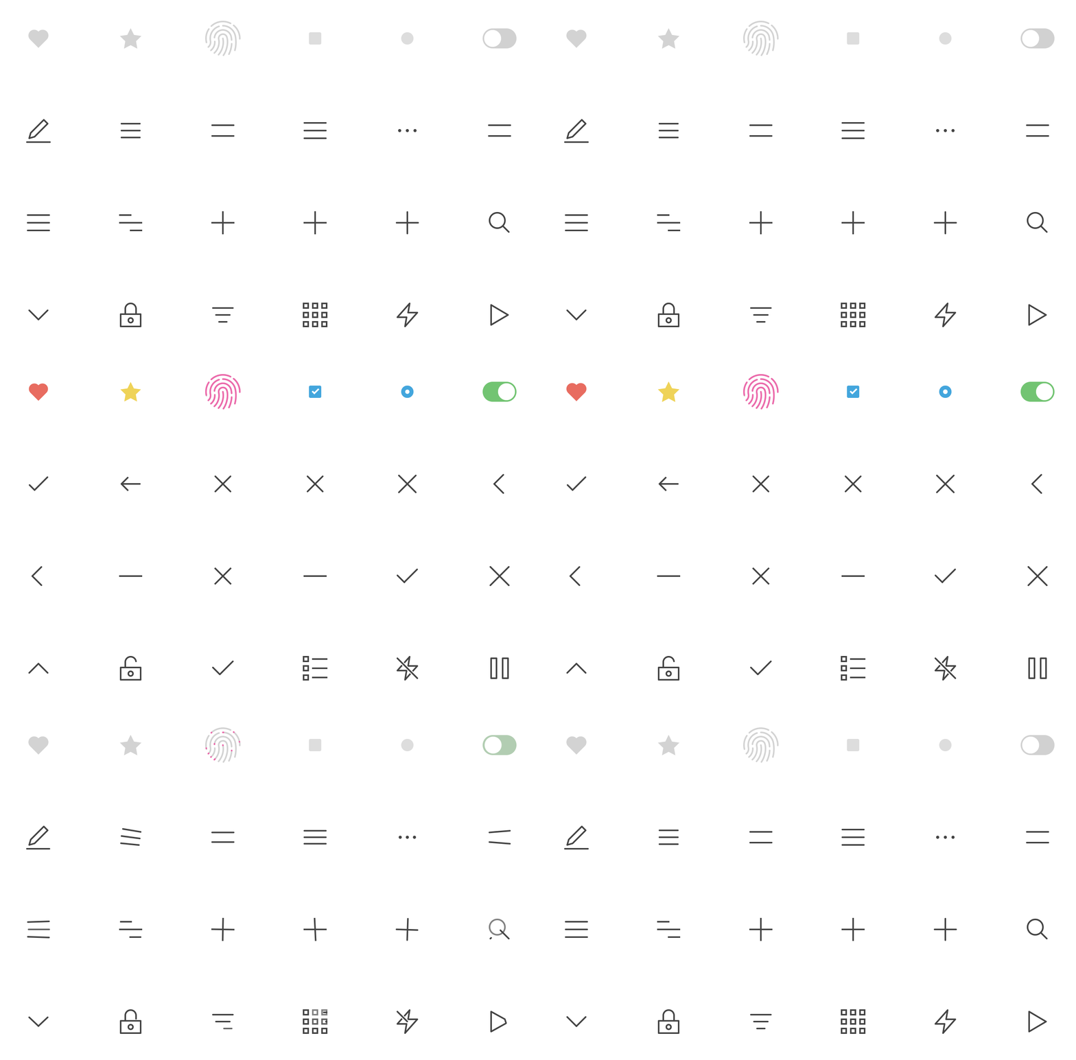
These light-weight icons can really enhance the UI of a website and as they’re SVG’s too – they are fully interactive on all devices and browsers.
When used correctly, this trend can really make a site look and feel more polished and complete. It gives the impression that the designer has taken their time to get things just right.
It’s a no-brainer, just do it!
General Advice
If I was asked to give our customers or other like-minded people some advice for the web in 2022, I would say the following 3 words: Speed, speed, speed.
With every passing month, Google reaffirms their stance on slow, poorly built websites stating that they will be penalised resulting in a lower Google ranking which could be devastating for small to medium sized businesses.
Essentially this could be the death of these ‘off-the-shelf’ website builders such as WIX, Mr Site, Et al. If building your own website is a serious option due to cost then I would say it’s not worth it. You could do more damage than you could imagine.
If you rely on website enquiries or calls originating from your site, if it doesn’t rank, you’re dead in the water. In essence, what Google are trying to do is promote well built, fast websites over the slower, more poorly built websites. The Google Core Vitals are the new metrics which will come into force that test your websites responsiveness, speed and performance and potential they could decide on the success of your website.

When is the right time to have a new website?
Letting a website linger way past it's sell by date will have a lasting, negative impact on your business but knowing when to start again can be tricky, so here's some tips and signs that will help you to know when to invest in a brand new website.
Here are some of the most obvious signs that your website needs a redesign:
The web has moved on.
The online industry moves at an incredible pace and new trends, techniques and layout options appear almost on a daily basis therefor it is inevitable that your website will be out of date at some point in the future. There is no getting away from this. Sure, you can re-skin a site (this can often be more expensive in the long run - Ed) and patch it up but your essentially putting a plaster on it until the next time.
Web Design trends are a funny business. They can have the 'wow' factor but they can also date a website badly. I have a checklist which let's me know if a trend is here to stay:
- Does it improve the User Experience?
- Does it improve website performance?
- Would the website be a success without it?
- Does it help the site achieve it's goals?
Using this checklist I have been able to utilise existing a new trends which are of benefit to the site as a whole.
The site is no longer fit for purpose.
If your website is effecting your day to day running or you can identify holes in the online ordering process the site is already not fit for purpose. Your website should work with your business and not produce problems or extra work for employees. it can often be frustrating if you are constantly working around your site or having to change your workflow because of it.
Using a Content Management System (CMS) that is not intuitive can also lead to frustration. It is important that you are fully trained to use your particular CMS once the site is built and neglecting this can lead to struggles further down the line.
If your website no longer works for you but against you, it's time for a redesign.
Your competitors are way ahead
This is a particularly tricky arena because sometimes following the trends of the market leaders can reap excellent rewards because your new and existing client base will already be familiar with the look and feel of your website and will reflect a professional approach to your business.
On the other hand, sometimes it is better to stand out from the crowd and put design first to help you achieve this. An example of this can seen with Apple in 90's when they decided to produce desktop machines that looked totally different to the beige boxes that were on the market at the time. Apple pivoted to put the emphasis on design led products which reaped dividends.
This choice is normally dictated by what market sector your business is in so consult an expert on the subject to find the best approach for your business.
You've not updated in ages
The average lifespan for a well designed website is normally 3-4 years but in all honestly, if you had a website built yesterday and it was built poorly, it's already time for a redesign! We get that your busy with the day to day operations of your business but your prospective customers want signs that you're professional about all aspects of your business and a dated looking website is a surefire way of losing potential business.
Your website should be your statement, your first impression and if it's dated or worse still, broken or not rendering correctly in modern browsers it will be harming your image and your reputation as a business.
Don't fall into the trap of thinking "It's only a website". In most cases it's the first place people go when speculating your services.
If you could attribute at least one of the following words or phrases to your existing website it's time for a redesign:
- dated
- slow
- bloated
- confusing to use
- not rendering correctly
- not mobile friendly
- hard to update
- Content Management System is confusing.
If you're wondering whether having a new website will help you gain business via enquiries or you want more traffic to your website, the simple answer is no. In this instance I would advise you to read about Search Engine Optimisation before completely rebuilding a possibly perfectly good website.
Conclusion
If you can relate to any parts of this post then you already know whether or not to redesign.
Having a new website built begins with an aim, a purpose. "What do you want your website to do for your business?" is one of our first questions we ask and we go from there. Make lists of requirements, functionality, sitemaps and anything else you can think of! Be open and honest and set goals. Take advice and if it is inline with your website's goals then go for it! Employ designers and developers that have a track record of delivering and for that reason alone, eSterling is a great place to start.
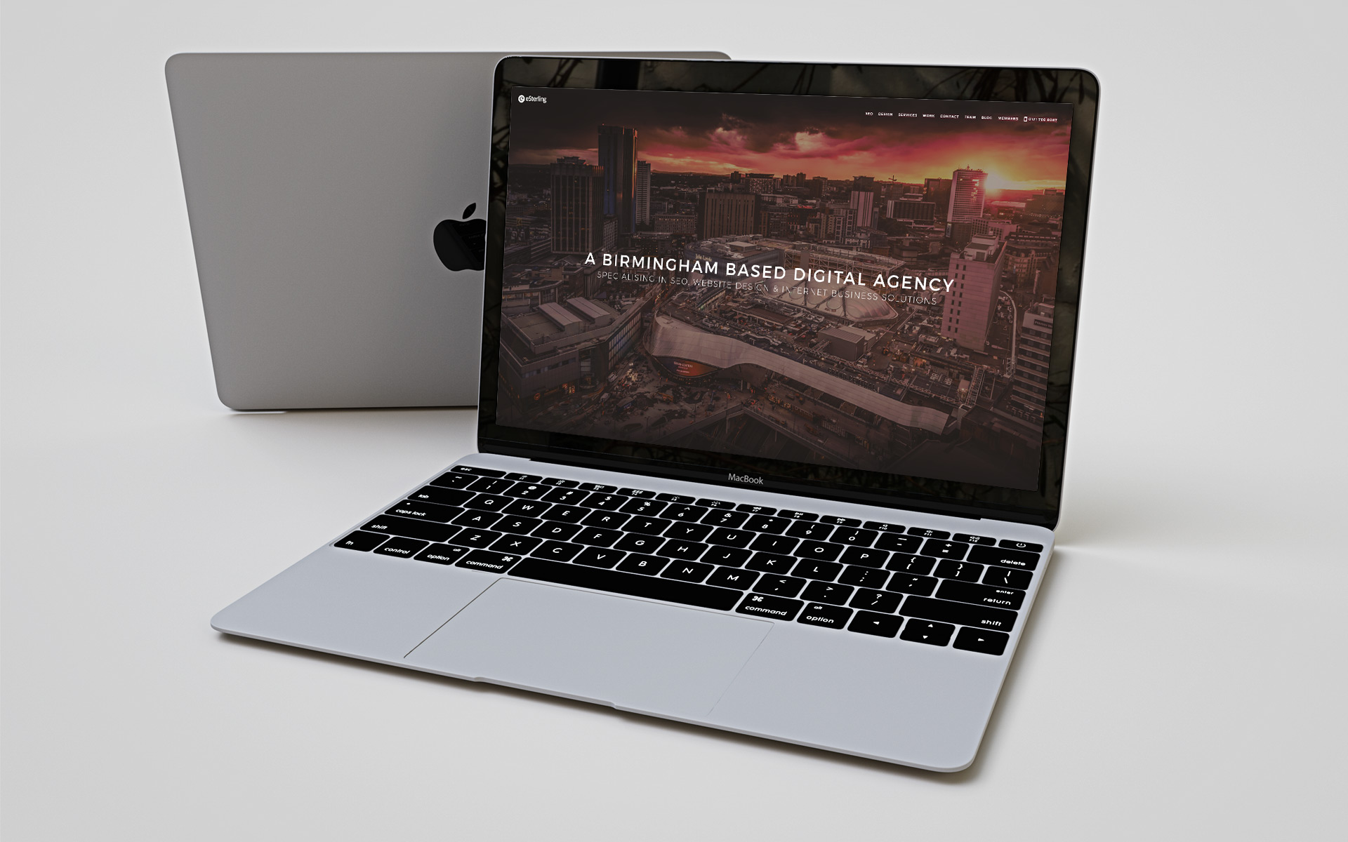
Behind the Scenes of the new eSterling Website
The new eSterling website has been a labour of love for myself for just over 18 months now and the result is so far removed from the original ideas and sketches I created back in the winter of 2015.
As we know everyone’s a critic so I knew my ideas had to be solid and without doubt, the right way to go. So with that in mind I set about tearing through the old eSterling website to find a more streamlined sitemap which focussed on three main elements:
- Who are we?
- What do we do?
- Evidence of our success
Once I got a defined page list I was able to begin sketching out the main pages which were to make up the bulk of the new website.
It quickly became evident that the copy from the old website did not have the tone I wanted for the new website – it was stuffy and very formal. So with the help of the beautiful people from our SEO department we were able to come up with more relaxed, engaging copy which reflected a more friendly approach.
After sketching out the layouts of all the main sections of the website and confirming the UI elements, I finally opened Photoshop to address the design’s look and feel. Once I’d selected the right design elements according to our branding guidelines and created some concepts from within Photoshop the home page began to take shape.
The home page dictates the style of the whole website and therefore, at that stage every design decision was pivotal in the make-up of the new site. Now, I would be lying if I said that this stage took a couple of days, it in fact took 3 months! The structure, layout, typography, imagery and individual elements had to flow and with this in mind I began to obsess over every little detail.
I had to draw a line in the sand and when I saw that my revisions were not as good as what I had originally designed I realised I had to move forward or risk the whole project going stale.
Decisions, decisions…
I then had a home page which I was (generally) happy with, the mobile and tablet versions were created alongside the desktop version using Photoshop’s lovely Art board feature.
So, do we need a CMS? If so, WordPress? What responsive framework do we use? Maximum grid width? Which font repository do we use?
In short I went with the following:
- No CMS - More light weight and we’re web professionals – we shouldn’t need a CMS to update our own website!
- A much scaled down version of Foundation – Light weight and simple to use
- Fluid grid system of 100% & 1200px – Why tie yourself down to just 1?
- Google Fonts – They have the right fonts and in the right weight
It’s these decisions that we make daily that are vital for any website we build, not just our own.
…It’s off to work we go
At this stage I was fully entrenched in Sublime Text trying to create the best website I’ve ever made. Beautiful, fast, informative, responsive, easy to follow, the list goes on! It was very challenging and a lot of fun!
I would often ask my fellow designers for their input and something which kept coming up was imagery. We lacked high quality images of the staff and premises so I scoured the web for Birmingham based photographers who could come in to eSterling Towers and take some beautiful pictures of the staff at work.
The name that jumped out was Ross Jukes. He was only in the office for what felt like 10 minutes but he produced some really amazing pictures for the new website. We hope you like them because we certainly do! Ross is available for commercial work so visit his website here.
The Launch
When taking on positive/negative criticism it is important for any designer to keep the initial vision and aim of the site firmly in mind. If any advice or criticism deviates from the original plan, discard it with a polite ‘Yea, I’ll look into it’, but it is just as important to accept criticism when it works towards your original goals. Don’t be too stubborn to accept it with a ‘Yea, that’s a good shout’.
Once the team had taken a good look at the website and decided it was ready, we then set about launching eSterling.co.uk v3.0.
The website launched on Thursday 4th August 2016 and I really hope you like it.
Special mentions: Richard Locke, Wave White & Antoniya Darova for glorious PHP and copy that makes sense!

Why mobile is so important for local businesses
Google recently asked Neilson Group to study the behaviour of people using mobiles to purchase. You can find the full report here but the main points to take away are these.
People are spending more than 15 hours a week researching potential purchases on their phones with their main method of discovering information being search engines, primarily of course, Google. The research showed that being local is the key with users wanting businesses to be within 5 miles. They also want to make their decision and purchase within an hour.
This is a clear sign that local businesses need to concentrate their attention on mobile users. Responsive design that caters to tablets and phone is no longer the purview of large national businesses. The most important driver in getting a user to your site and to make a purchase is making sure their experience is smooth and engaging. If your website can provide that optimum user experience on a mobile phone you will be well on your way to being ahead of the competition.
If you need help getting your website mobile ready call eSterling on 0121 766 8087.

It’s 2014, shouldn't your site work on mobile?
Major retailers have made the transition to support mobile devices and there is a growing necessity for smaller brands and businesses to follow suit. In the last week of December John Lewis saw 75% of the traffic to their online shop being made up of tablets and mobile phones. Shoe retailer Schuh found that nearly 70% of traffic came from mobile devices over the same period.
The facts are simple. If you have a website it has to cater to users accessing the site through a tablet or mobile phone. If you don’t you will be loosing business. A website that doesn’t display correctly, is slow, has a Flash intro, or is inconvenient to navigate will dissuade users. Those users will go to a competitor due to the frustrations of trying to use your website. If you sell online then then you practically speaking have little choice but to upgrade the design of your website or face the inevitable decline in sales.
Your first new year’s resolution should be to get a refresh of your site to make it responsive and work across all devices. Why not give eSterling a call and let us see what we can do to increase the sales through your website.
